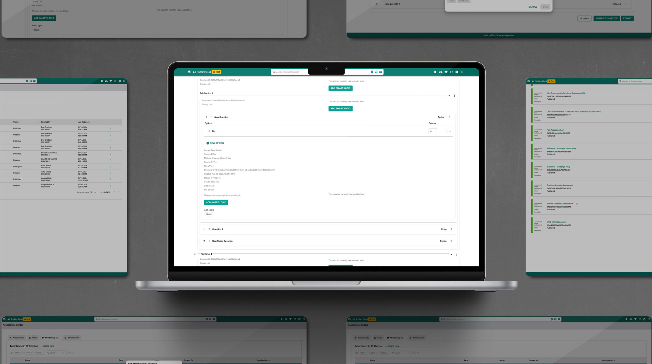
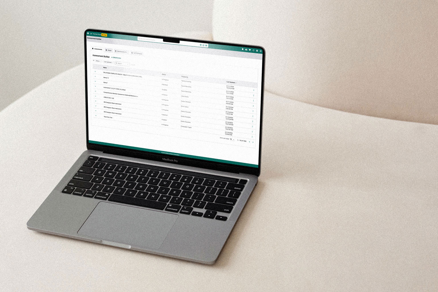
Builder Suite platform interface

Centene · Healthcare · Internal Platform

Builder Suite

Designing and leading a product suite for care management teams to handle healthcare claims, assessments, and member data at scale.

Role

Senior Product Designer

Company

Centene

Product

Builder Platform

Platform

Web

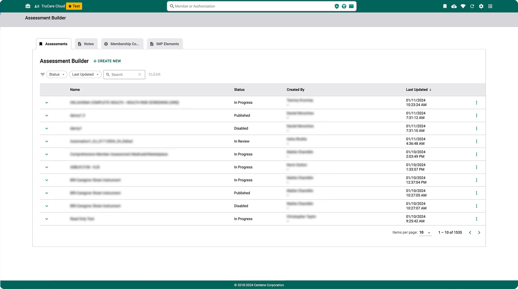
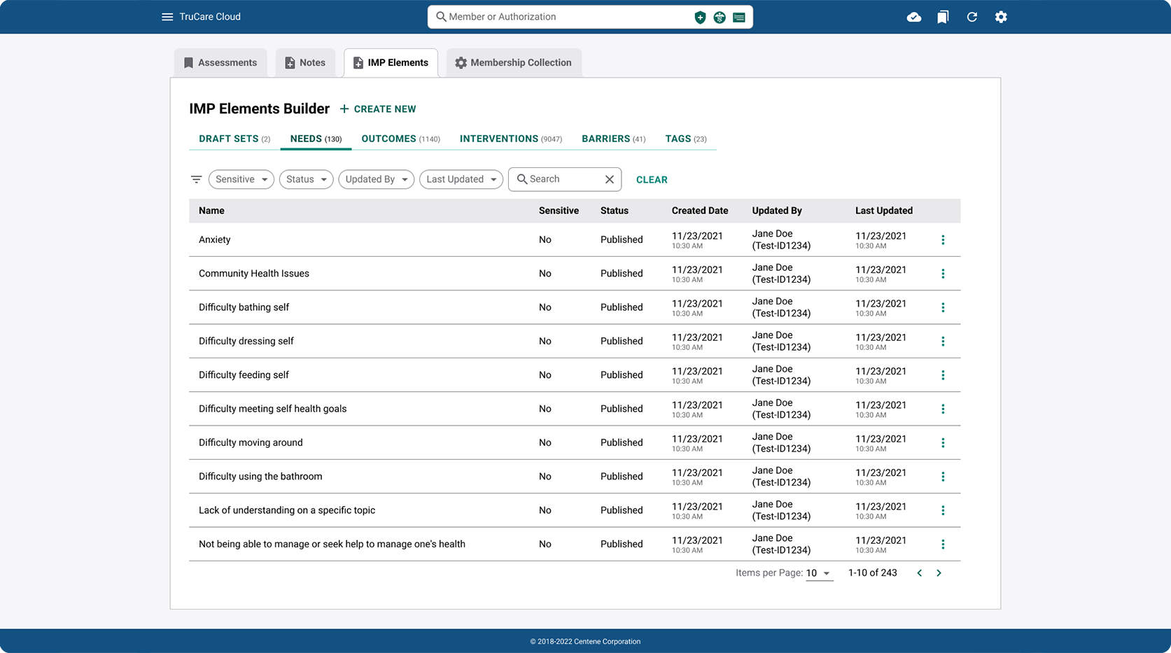
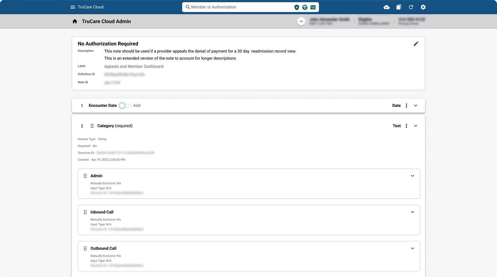
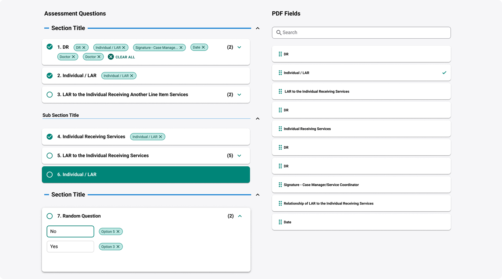
Centene's care management teams were juggling disconnected tools to manage healthcare claims, assessments, and member data, with no unified platform tying the workflow together. As the sole product designer on the team, I was responsible for four distinct products: Assessments, Notes, IMP (Individualized Management Plans), and Membership Collections. Each had its own user base, data requirements, and compliance constraints, but they all needed to work as one cohesive suite.

Assessments dashboard view

The Assessments dashboard, one of four products I designed for the Builder Suite. Assessments handled intake evaluations and health screenings for care management teams.

I interviewed care management team members and product owners across each of the four product areas and what the research actually revealed was a workflow problem: care managers were spending significant time re-entering the same member data across different tools because the products didn't share state. A nurse completing an assessment had no visibility into notes from a previous session, and IMP data lived in a completely separate system.

This insight reframed the entire design challenge. The goal shifted from "make each product easier to use" to "make these products aware of each other." From a UI perspective that meant consitent alignment with our Lead Dev and working backwords through data pipelines ensuring each state had a single source of truth. That distinction drove every major design decision that followed.

IMP Elements interface

IMP Elements, the Individualized Management Plan builder. I designed this to pull relevant assessment data forward automatically, eliminating the redundant data entry that care managers flagged in research.

The core design tension was maintaining each product's distinct identity while making the suite feel unified. I adopted a simple color ID convention where each product retained its existing brand color, which I wove subtly into headers, status indicators, and navigation accents. This way, care managers always knew which product context they were in without needing to read a label, while the underlying layout patterns, component library, and interaction models stayed consistent across the suite.

I chose this approach over a fully homogenized design because the research showed that care managers identified strongly with "their" product. Stripping that identity would have created orientation problems for users who spent most of their day in a single tool.

Care Management claimant page

A claimant detail page showing the color ID system in practice, with consistent layout patterns and product-specific color accents for instant context.

Each product's detail pages had to accommodate hundreds of possible user paths, data states, and edge cases unique to personal health information. A single assessment page could look completely different depending on the member's health conditions, age, and demographic data. The initial approach of showing every possible field and letting users skip what wasn't relevant created overwhelming forms that care managers found frustrating.

I improved the design of our smart logic system that dynamically adjusted content based on known member data. Once a profile indicated specific conditions or demographic factors, irrelevant fields were automatically removed and known values were pre-filled. This was a significant engineering lift, so I had to build the case by mapping exactly which fields could be safely automated versus which required manual clinical judgment. That analysis became a decision matrix I maintained throughout the project.

Smart Logic implementation showing dynamic field adjustment

Smart logic in action. The system dynamically removes irrelevant fields and pre-fills known data based on the member's profile, reducing form completion time and cognitive load.

The Builder Suite replaced Centene's disconnected toolset with a unified platform where Assessments, Notes, IMP, and Membership Collections shared data and design patterns. The smart logic system reduced the number of form fields care managers encountered per session, cutting average assessment completion time and reducing data entry errors from redundant manual input. Cross-product data sharing meant care managers could access a member's full history from any product in the suite without switching tools.

The color ID convention and modular component system I established became the foundation for subsequent product additions to the platform, giving Centene a scalable design language that extended well beyond the initial four products.

The new and improved Builder Suite

The unified Builder Suite. Four products, one cohesive platform built on shared data, consistent patterns, and smart logic.

Previous Sales Hub+ Next Google CRM