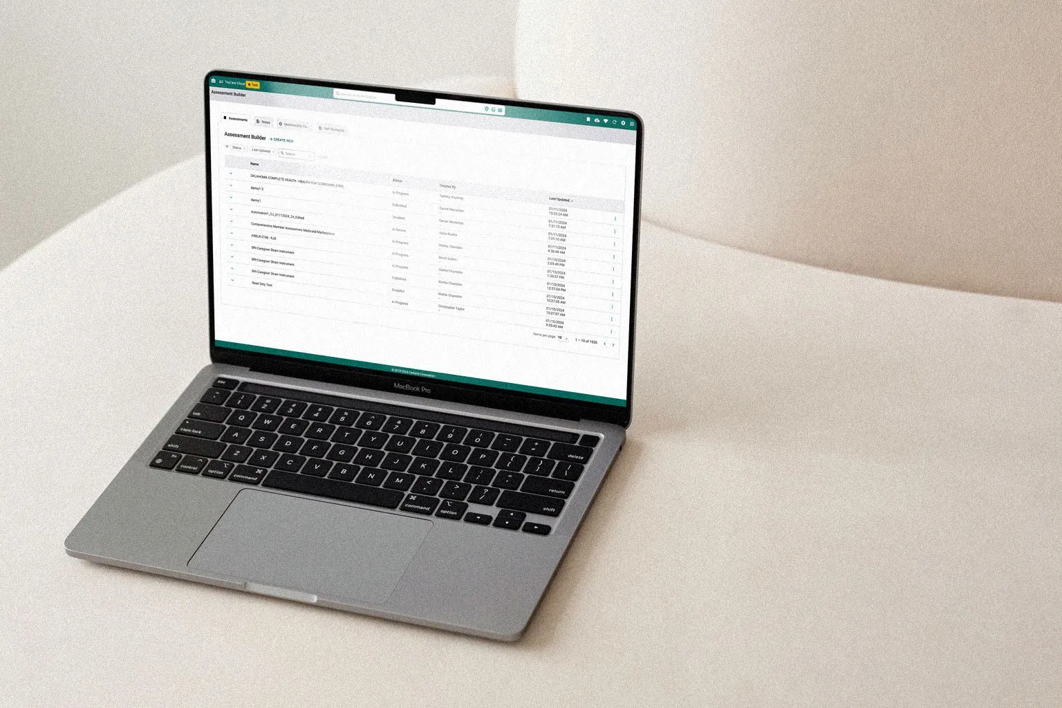
Builder Suite
Four healthcare products, one designer: unifying Centene's care management tooling for claims, assessments, and member data into a single coherent platform.
- Role
- Senior Product Designer
- Company
- Centene
- Product
- Builder Platform
- Platform
- Web
- 4products, one design owner
- 100sof user paths handled by smart logic
- WCAGaudits built into every delivery
- 1shared design language across the suite
The Challenge
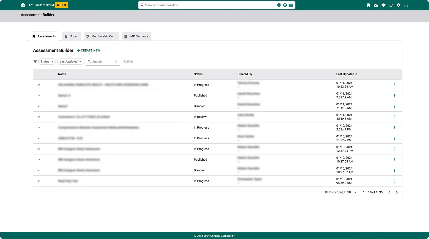
Centene's care management teams were juggling various tools to manage healthcare claims, assessments, and member data, with no unified platform tying the workflow together. As the sole designer, I owned four distinct products at once: Assessments, Notes, IMP (Individualized Management Plans), and Membership Collections. Each had its own user base, its own data requirements, and its own compliance constraints, and they all needed to work as one cohesive suite.
Being one designer across four products meant every decision had to come from research and thoughtful iteration.
Research & Discovery
I interviewed care management team members and product owners across all four product areas. The research revealed something more fundamental than usability problems: a workflow problem. Care managers were spending significant time re-entering the same member data across different tools because the products didn't share state. A nurse completing an assessment had no visibility into notes from a previous session, and IMP data needed approvals which had its own pain points when accessing.
That insight reframed the entire challenge. On the UI side, that meant working backwards through the data pipelines with our lead developer to ensure every state had a single source of truth. That distinction drove every major design decision that followed.
Unifying Four Products
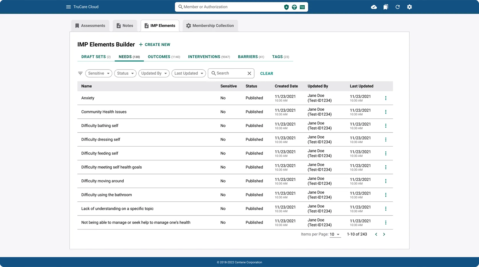
The obvious move was full homogenization: one visual language, four identical products. I rejected it. Research showed care managers identified strongly with "their" product. Most spent their entire day inside a single tool, and stripping that identity would have created real orientation problems.
Instead I designed a color ID convention. Each product kept its existing brand color, woven subtly into headers, status indicators, and navigation accents, while the underlying layout patterns, component library, and interaction models stayed strictly consistent across the suite. Care managers always knew which context they were in without reading a label, and the suite still behaved as one product.
Designing for Smart Logic
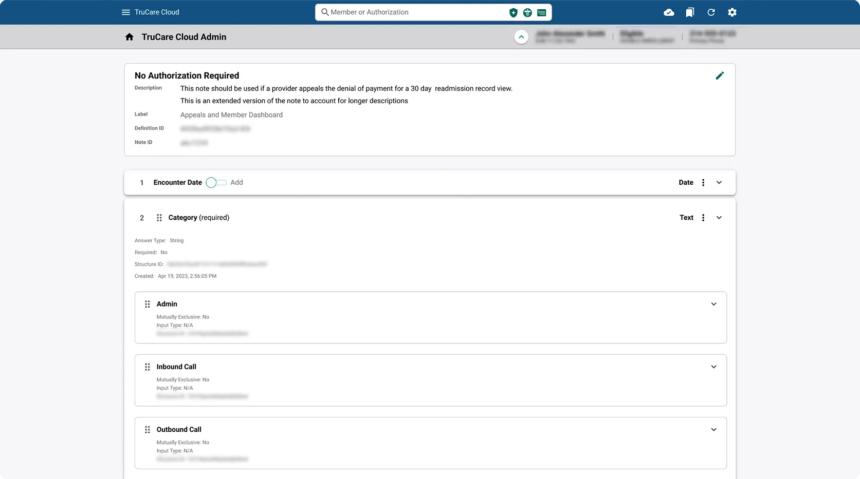
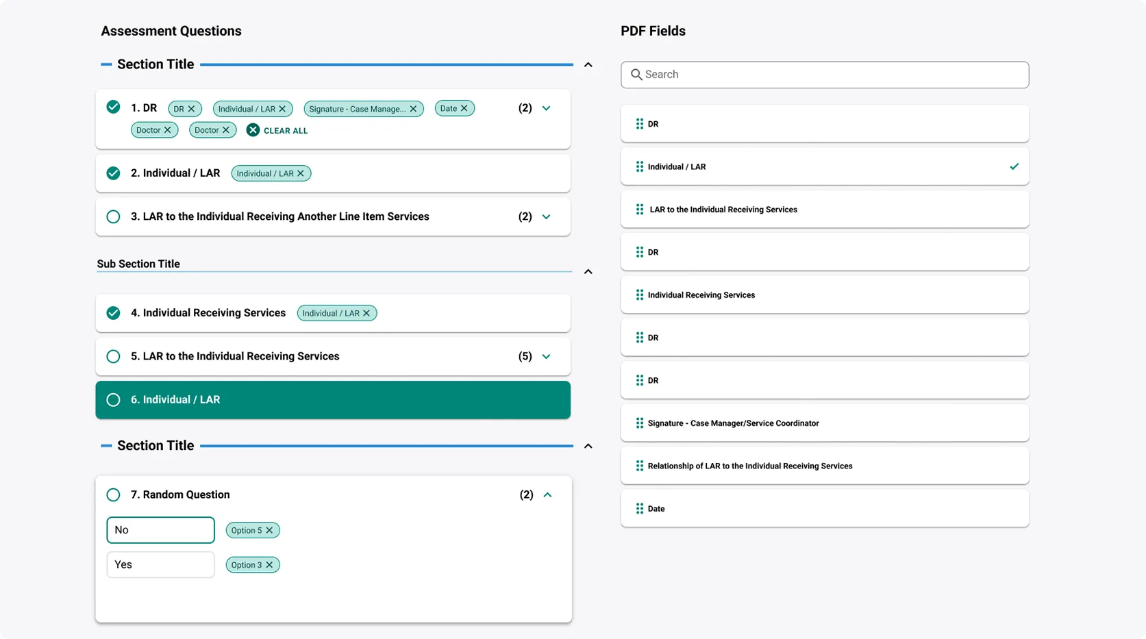
Each product's detail pages had to accommodate hundreds of possible user paths, data states, and edge cases unique to personal health information. A single assessment page could look completely different depending on the member's health conditions, age, and demographics. The initial approach of showing every possible field and letting users skip what didn't apply produced overwhelming forms that care managers found frustrating.
I improved the design of our smart logic system to dynamically adjust content based on known member data: once a profile indicated specific conditions or demographic factors, irrelevant fields were removed automatically and known values pre-filled. This was a significant engineering lift, so I built the case for it by mapping exactly which fields could be safely automated versus which required manual clinical judgment. That analysis became a decision matrix I maintained throughout the project, and it became the shared language design and engineering used to negotiate scope.
Leading Beyond the Screens
Quality had to survive without me in the room, so I built it into the process. I led formal WCAG accessibility audits as part of the delivery cycle itself, treating compliance as a shipping requirement rather than a best-practice afterthought. I wrote an internal design onboarding guide in Confluence documenting our systems, resources, and the rationale behind decisions, giving new designers a structured ramp into the product.
I also mentored junior designers through co-design sessions and structured QA reviews, establishing team rituals for feedback that raised the overall quality bar beyond any single review.
The Outcome
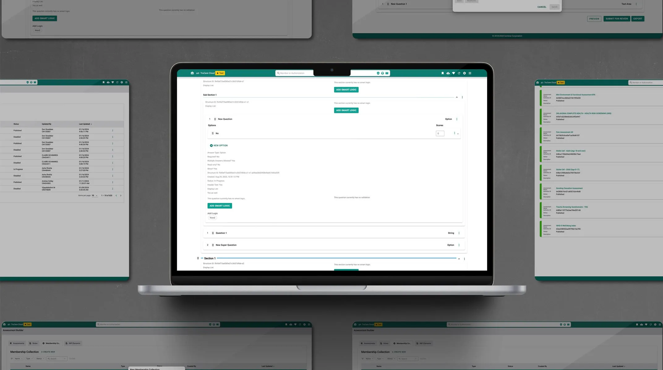
The Builder Suite replaced Centene's disconnected toolset with a unified platform where all four products share data and design patterns. The smart logic system reduced the number of form fields care managers encounter per session, cutting average assessment completion time and reducing the data-entry errors that came from redundant manual input. Cross-product data sharing means a care manager can reach a member's full history from any product in the suite without switching tools.
The color ID convention and modular component system became the foundation for subsequent product additions, a scalable design language that outlived the initial four products.
Reflection
One of the biggest lessons from this project: sometimes the most useful thing a designer makes isn't a mockup, it's a spreadsheet. The decision matrix did more to get design, engineering, and clinical stakeholders on the same page than any screen I produced, because everyone could finally see the tradeoffs in one place. The project also changed how I think about consistency. Making everything look identical isn't the same as making it feel like one product. The real skill is knowing which differences actually help users find their footing, and which ones are just noise. Given another run, I would get design and the data teams aligned on shared state even earlier. It was the deepest dependency in the project, and everything moved faster once it was settled.